Posted by Fashion Junior at Large
I've just got back from the Preen presentation and am in love. You'll know from my post the other day that Preen was mine (and as sarah Mower told the Fash Ed yesterdays, her) highlight of NYFW so it felt like a real privilege to be able to view the collection up close this morning.
I also spoke to Justin Thornton, designer at Preen alongside Thea Bregazzi. I had seen that the collection was inspired by Virgina Woolf but I knew that this was no straightforward copy of Virginia's 'look' as that would have involved drab dresses and dull colours. Thornton told me that Woolf's seminal novel
Orlando, which charts the adventures of the epnonymous protagonist as he (then she) lives through a number of times and places (that is a very crude synopsis!) was the central starting point. Ultimately it was the element of reincarnation which the Preen team took as their spin on the Virgina Woolf theme.
 |
| Frills and peplums were subtley pretty |
 |
| Virginia Woolf circa 2012 |
 |
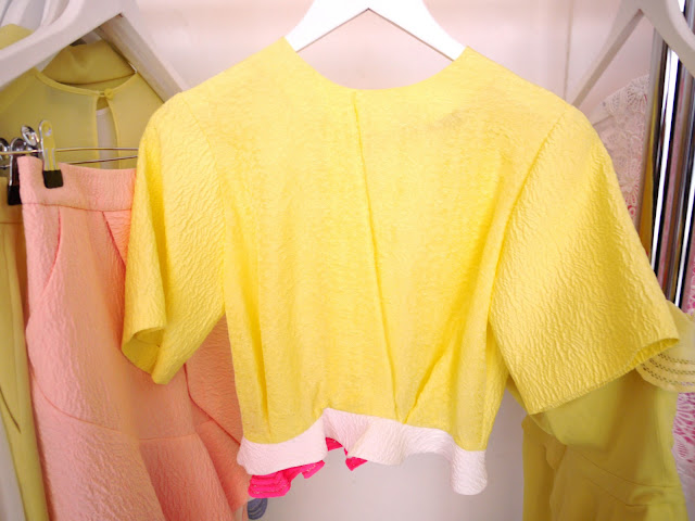
| Lots of great tailoring underpinned this collection - and excuse me, how great is this shade of yellow? |
Thus, this collection brings Woolf into SS12 so that this does not look like another rehash of the 20s and 30s which really, with that theme it could so easily have been. Instead it feels precisely of the moment with details which reflect those historical references; the lemon shade which is accented throughout came from a recurring reference to this colour from the botanical writings of the time, the frills at the wrists reflect the fact that Woolf would always have a handkerchief tucked up her sleeve.
 |
| Frills for hankies |
The botany theme is also reflected in the digitised prints which were created from an intial scan of a peony. There is also an enlarged lace print which came from a contemporary sample. I also noticed that there were lots of back details in the collection, particularly cut-out shapes or alternate colours and fabrics- my favourite example of this is the white dress with fuschia chiffon pleating on the back.
 |
| Bloomsbury print- ladylike but then sexy with a midriff- perfect combination |
 |
| Stunning back detail |
Thornton told me that a collection which is made up of quite simple silhouettes, as this one is, lends itself to transforming the look from front to back. Midriff and back baring feel very modern he commented- a sentiment which many designers are picking up on and so interesting to see the varying interpretations.This is a collection full of favourites... I couldn't choose one piece.
 |
| The sequins were originally going to tie in with the graphic element of the digitised print but it was then decided to make them more scattered for a contrasting effect. The work was done by hand in India. |

 |
| This guipere lace top is cut out at the back, and lined in fluror pink as you can see in the shot above. From prim to modern sexy in one about turn. |
Photos: Fashion Junior at Large


0 comments:
Post a Comment